

April 11th, 2024, posted in learning
by Adelina
This article is part of the Foundation series of our UFOs UI/UX Framework. The framework is a tool we created based on our 10+ years of experience in building complex software and thousands of hours of design meetings and feedback. Developers, designers and entrepreneurs can use this framework to gain a better grasp of the UI/UX process and build awesome apps as a result. To learn more about the UOFs UI/UX Framework and each framework component, please go here.
This article is part of the “F” from UFOs, the framework component that talks about the backbone of UI/UX design, the elements almost every design relies on.
If you`ve heard of UI kits, you probably know they're great for speeding the design process and for helping developers implement designs easier. However, they are also a great tool for understanding the UI/UX design process. By reverse-engineering design kits created by professional designers, you can get a fairly good idea of what UI/UX is literally made of.
The anatomy of a UI Kit
At its most basic, a UI Kit is a collection of frequently used UI components and some fundamental design style guides. Good kits usually follow a design system. Here are a few examples of several free to use ones:
In general, if you download one, there's a big chance it will come with some of the elements listed below.
UI components
Depending on the design kit, it can include anywhere from dozens to hundreds of UI components. These can vary in complexity, from the most basic building blocks such as buttons and input fields to more advanced elements like tables. UI components may come in different:
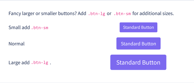
- sizes: most design kits define standard sizes (small, normal, large) at least for basic elements such as buttons, input fields or dropdowns.
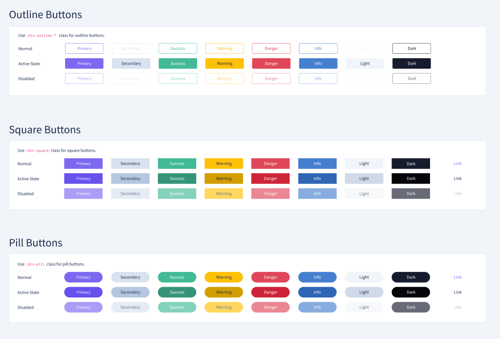
- styles: again, most kits come with at least two or three styles of buttons: rounded buttons, square buttons, outline buttons, buttons with icons etc.
- states: this is a big time-saver since you can have various states of the same element already designed (enabled, disabled, on hover, clicked etc.)
Example pages
Even the most imaginative people would have a hard time picturing how all these UI components fit together. This is what example pages are for. Example pages are included as a way to show what you can build with the design kit and how it might look. Some of the most frequent example pages include:
- Dashboards: since they are generally complex and include a lot of elements, dashboards are a good way to see what the UI Kit can do.
- Tables: most admin panels include a lot of tables, so example pages usually feature a table page with CRUD operations.
- Login and register pages: one of the first things users will see, so most kits include these as example pages
- User profile: another feature commonly found in most apps and in most example pages
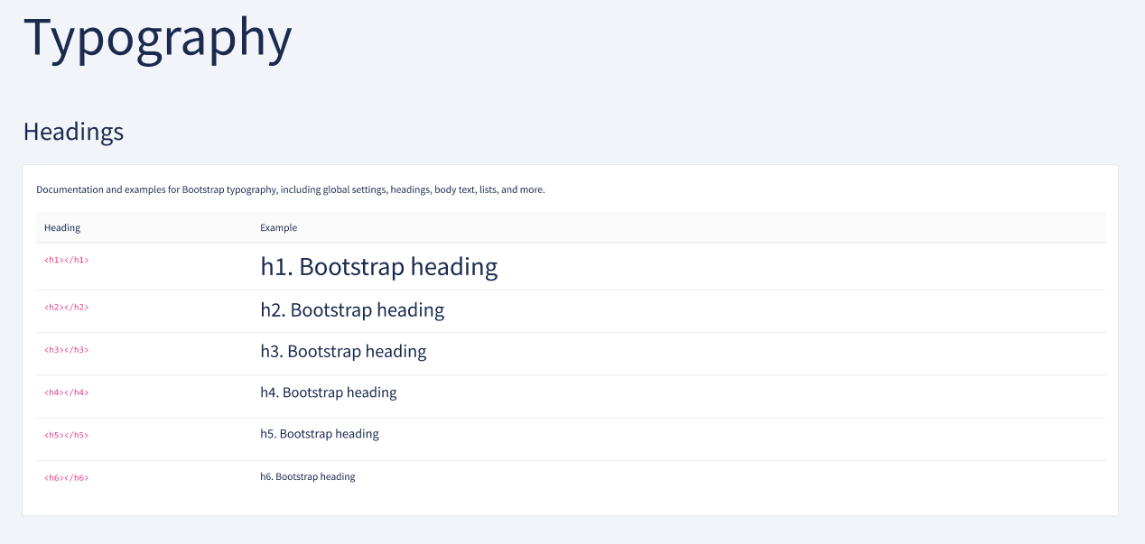
Typography
Such files also come with typography rules which are meant to:
- define text sizes: headlines (usually h1 through h6) and body
- define text styles: primary text, muted text, success text, warning text, captions etc.
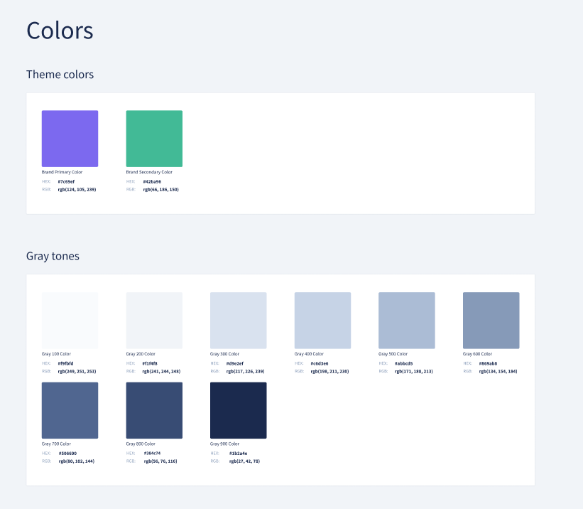
Colours
Kits usually include a color scheme which is applied throughout and can be broken down into various categories, depending on how the file is organized:
- Primary colors (one or two) - used in pure form for primary actions, active navigation elements etc. The primary color is usually the theme colour, what you think of when you think of that particular design kit. Of course, you can have various shades for each primary color.
- Background colors - usually neutral, a lot of gray tones
- Accent colors - all the yellows and greens and reds for signaling various states. Can also include other colors.
Icons
Some files also include the icon packs that were used throughout the designs or a link to the icon pack plug-in. In Figma, for example, you can install the plug-in and import the icons directly.
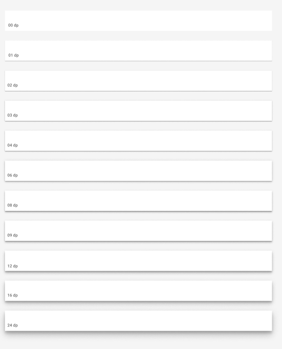
Elevation
Some design kits define elevation rules for the components. Essentially, these are shadow styles, so that, based on how big the drop shadow is, you can have elements which appear closer or further away from the background.
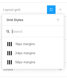
Grids
Sometimes kits also come with grids for various container sizes, from small to wide. Usually, these follow 12 column Bootstrap grid options.
Using a UI Kit in Figma
As comprehensive as a kit can be, there's a big chance you`ll need some basic tailoring to make it your own. And to design an app that stands out. The following section deals both with how to use a UI Kit in Figma, a popular design & prototyping tool, and how to customize some basic presets.
If you want to see such a kit at work, check out our case study on how we used the Backpack Figma Template to design the administration for a tech dictionary.
Getting started
If your kit comes as a .fig file, upload it in Figma either by dragging and dropping it or by clicking the New > Import button and selecting the file.
Alternatively, you can go to the Community section in Figma and search for a UI Kit or a wireframe kit. By duplicating a file from the Community (click on Duplicate), the file becomes editable in your own Figma account and you can use it as you like.
Select the frame size you`ll be working with - Figma comes with predefined sizes for phone, tablet, desktop, which you can see on the right-hand side when you create a frame. If your design kit comes with predefined grids, you can activate the grid option from the Layout Grid menu.
Copying components
Copy the ready-made UI components and start using them in your design. You can do this in several ways:
- select an element and use the regular CTRL-C CTRL-V commands
- select an element, hold ALT and drag. This will create a copy of that element.
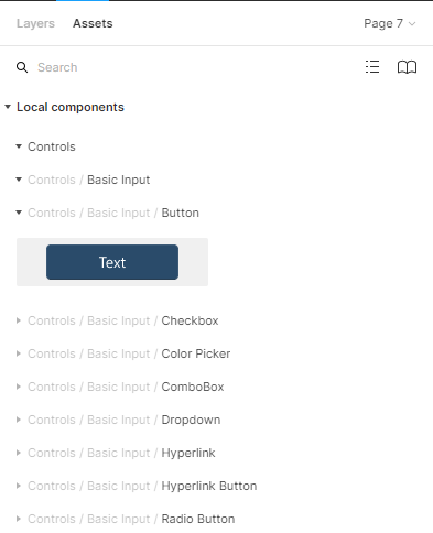
- use the Assets menu to identify the needed component and then simply drag it in your workspace
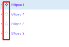
The copies you create are children of the parent component. This means that whatever changes you do to the parent, they will also be applied to the child components. Parent components are represented through a diamond symbol, while the children are symbolized through an outline.
Overriding presets
Most of the things mentioned in the Anatomy section, such as colors, typography, elevation and grids come as predefined styles in Figma with your UI Kit. You can see them under Text Styles, Color Styles, Effect Styles and Grid Styles. You can edit them by clicking the Edit Style button.
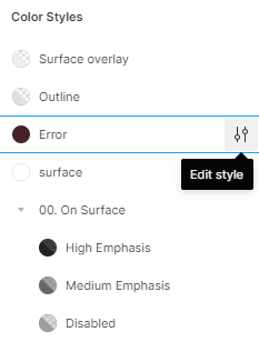
When you edit a style, all components which have that style applied to them will be edited.
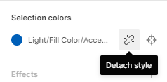
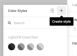
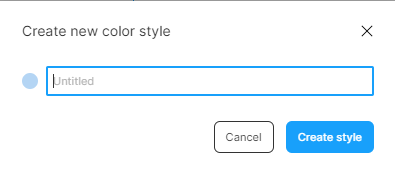
Of course, you can also detach a component from its predefined style. This will allow you, for example, to edit the colour of that component only and maybe define a new color style based on that. To do that, select the new color and click the + button in the Color Styles widget and give the new color style a name.
In a similar manner to styles, you can detach child components from their parent components. Child components can be edited separately from their parent component, but that's available only for stylistic changes (like changing the colour). If you want to resize a child component, you need to detach it from its parent first, resize it and recreate it as a parent component itself.
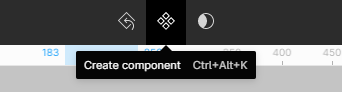
To detach a child component, simply right click it and select “Detach instance”. To create a parent component, click the diamond symbol in the upper menu.
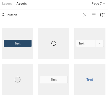
Finding things easier
UI Kits can feel huge and overwhelming. To find things easier you can search directly in the Assets menu for the component you need. This will show you thumbnails of the existing components for that keyword.
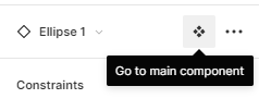
If you want to find the parent component of a child component faster, you can select the child component and click “Go to main component”.
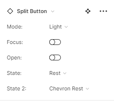
Some design kits even have Variants put in place, so you can find versions of the same component easier. In Figma, Variants are used to quickly switch between different styles or states (active, inactive, pressed, on hover) of the same component. If yours comes with Variants, select a component and you will see in the right-hand panel dropdowns and toggles allowing you to change between various options for that component.
Now imagine doing all this from scratch. Sounds kind of time-consuming and a hassle to organize. That's why UI Kits are a great starting point for design and development projects. And also a great way to gain a more structured understanding of the UI/UX fundamentals.
Whether you want to use a ready-made kit or you`re looking for a custom design for your app, we can help. You can check out our case study on how we used the Backpack Figma Template to design the administration of our tech dictionary project.
Drop us a line at [email protected] and let`s talk UI/UX.


